Gothic Grunge - Tutorial
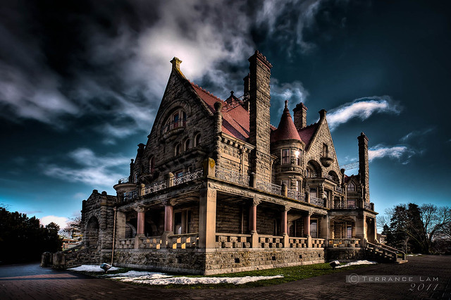 |
| Quarreling Castle - Craigdarroch Castle, Victoria, BC |
This tutorial covers how to recreate the effect with your own images and for those that like presets, I also included the Lightroom preset you can just download and install yourself.

To start off with. You need the right kind of image to create the effect and to shoot it in RAW format (this doesn't work at all with JPG images). I suggest something with some drama to begin with. A scene with high contrast and lots of clouds is a great starting point. Expose your image as you normally would, or expose a little under to get more drama from the clouds. I will point out that I do use cameras that have high dynamic ranges which makes the process a little easier for me to do, but it doesn't exclude older cameras from the process (just a little nosier however kind of adds to the effect). Don't worry if your images are not quite exposed correctly. You're going to go through some extremes, and likely will need to adjust to your taste.
After you import the image into Lightroom, you'll need to adjust some basic settings. Click on the develop module and find the 'Basic Settings' tab.
 |
| Basic Panel Adjustments |
Next Exposure is adjusted to make it darker. Now if your image is already underexposed to begin with, I'd avoid adjusting that setting.
Next is contrast. You need to crank that down quite a bit. The reason for this is to flatten the contrast just a bit for some tonal recovery.
Tonal recovery is then done in the Highlights and Shadows. I crank them to the extremes as you can see in this screenshot. Highlights specifically to make the clouds look way more dramatic. Shadow is just shy of maximum. I also need to recovery some of my contrast after this. So I turn up the Whites to give some highlighting and the Blacks to give some shading. The object in this is to create an illustrated look. By simulating what artist see and interpret onto paper, this technique comes closest to that effect. Although some might suggest that HDR does something similar, the problem with HDR is that it can create overcooked halo looking images. Through my process, you can control it much better and you retain a really sharp look to your images rather than the heavenly glow that HDR sometimes creates.
 |
| Colour Adjustments in HSL |
Next I adjust the Presence of the image. This is an important step and it might vary slightly depending on your camera. Clarity is cranked all the way up. I want to harden my edges to give it that illustrated look, but be cautious about maxing it out. This will cause some haloing if you do max it out. Vibrance is then adjusted all the way down. This controls a lot of my blue colours so I want to create some drama and I crank it down (more on that later). Saturation is boosted just slightly up, so my rich reds and other tones take on a graphic ink kind of colour. You can boost it more if you like, but it really starts to look surreal if you go too far.
The next set of adjustments is a little more subjective. In the HSL tab, you need to adjust your colours slightly. The origin of my process actually came from doing a lot of IR photography adjustments. So by using some similar Luminance adjustments, I used those kinds of adjustments to create my illustrated and gothic look.
 |
| Details for sharp effects |
After you make the initial colour adjustments, you might want to tweak it some more. But I tend to come back here after I make my other adjustments.
The next thing you need to do is adjust your details. Here I want to give some grittiness. I'm not worried about noise at all. In fact I usually turn it off in both slider. If you want to get rid of some color noise then you can adjust that, but I crank up the sharpening (over-sharpen) to really make the details pop. The radius is adjusted to avoid sharpening artifacts. However you may need to tweak it a little. Masking helps retain some smoothing of colors. Especially since I turn down Noise Reduction, you might want to have more masking as it often enhances noise.
 |
| More drama through Effects |
Use the roundness to control the shape of the vignette. Sometimes I like perfectly round, other times I like it a little more corner influenced. It all depends on your image.
Lastly I add some grain to the image. You can decide how much you want to add. In my stock preset I use just enough to give some grit to the buildings.
 |
| Adjusting the skies further. |
 |
| Painting in highlights for areas for more illustrated effects |
 |
| Final Results |
If you want to save yourself some trouble of all the initial adjustments, you can download my preset here: http://db.tt/Z8KKsMVy and then make all the necessary adjustments afterwards.


Brilliant tutorial.... Many thanks.
ReplyDeleteHave you tried applying the preset, doing local adjustments, then exporting to Photoshop as a TIFF file for local adjustments (or just export as TIFF and cancel), then applying the preset again to the TIFF image.
Very surreal cinematic effect....
I often will do that to double the effect. There's enough leverage in my files that I can do that.
DeleteThanks for the comments.
My first attempts at applying your excellent technique. Thanks again:
ReplyDeletehttp://www.paddenphotography.co.uk/blog/2012/10/gothic-grunge-terrance-lam